When working with dynamic Magnetic Resonance Spectroscopy (MRS) or Magnetic Resonance Imaging (MRI) data, you rarely deal with a single spectrum. Whether you are tracking a dynamic metabolic timecourse, inspecting multi-echo relaxation data, or looking for motion artifacts across hundreds of transient averages, visualizing 2D datasets is a constant challenge.
Plotting 50 overlaid spectra on a static matplotlib axis quickly becomes an unreadable mess of overlapping lines.
To solve this, xmris provides an interactive, browser-based ScrollWidget. It allows you to fluidly scroll through multidimensional data, animate the transitions, visualize fading historical traces to see trends, and—most importantly—extract specific slices directly into reproducible code.
import matplotlib.pyplot as plt
import numpy as np
import xarray as xr

import xmris
1. Generating a 2D Time Series
Let’s generate a synthetic 2D dataset representing 50 transient repetitions. We will simulate a decaying signal (e.g., relaxation) and inject a massive motion artifact at repetition #25.
Source
# Generate synthetic 2D data
n_reps = 50
n_points = 1024
ppm = np.linspace(10, -2, n_points)
repetitions = np.arange(n_reps)

# Simulate a decaying peak at 4.7 ppm (Water) and a stable peak at 2.0 ppm (NAA)
ppm_mesh, rep_mesh = np.meshgrid(ppm, repetitions)

# Peak 1: Decaying
peak_water = 10.0 * np.exp(-rep_mesh / 15.0) / (1 + ((ppm_mesh - 4.7) / 0.1)**2)
# Peak 2: Stable
peak_naa = 3.0 / (1 + ((ppm_mesh - 2.0) / 0.05)**2)

clean_data = peak_water + peak_naa

rng = np.random.default_rng(42)
noise = rng.normal(scale=0.2, size=(n_reps, n_points))
data_2d = clean_data + noise

# Inject an artifact at index 25
data_2d[25, :] += 5.0 * np.sin(2 * np.pi * 5 * ppm)

# Build the xarray DataArray
da_series = xr.DataArray(
    data_2d,
    dims=["repetitions", "ppm"],
    coords={"repetitions": repetitions, "ppm": ppm},
    attrs={"xmris_synthetic": True}
)
2. Launching the Widget
You can launch the interactive viewer directly from the .xmr.widget accessor. Pass your 2D DataArray to the scroll_spectra function.
The widget will automatically detect your spectral dimension (e.g., ppm) and assign the remaining dimension (e.g., repetitions) to the scroll wheel.
# Launch the interactive widget
da_series.xmr.widget.scroll_spectra(show_trace=True, trace_count=5)Using the Widget
Once rendered in your notebook, you can interact with the dataset using the following controls:
Mouse Wheel: Hover over the canvas and scroll up/down to seamlessly step through the repetitions.
Keyboard Navigation: Use the
Left/Rightarrow keys to step, orHome/Endto jump to the boundaries.Playback: Click the
▶button (or press theSpacebar) to animate the sequence automatically. This is incredibly useful for spotting transient motion artifacts that flash on screen.History Trails: Toggle the “History Trails” checkbox and adjust the “Depth” slider to show fading previous traces (in lighter blue) behind the active trace. This provides instant visual context for signal decay or growth.
3. Extracting a Target Slice
While scrolling, you will likely notice the massive artifact we injected halfway through the acquisition.
Interactive widgets are excellent for finding these bad transients, but to remove or process them, you need to bring that knowledge back into your Python pipeline. xmris strictly enforces data lineage, meaning we do not want the widget to modify the array behind the scenes.
When you locate the artifact (index 25), click the Extract Slice button in the widget control bar. The canvas will unmount and provide you with the exact xarray command needed to isolate that trace.
Click the Copy Code button, and paste it into the next cell in your notebook:
# This code is pasted directly from the widget's completion screen!
slice_da = da_series.isel(repetitions=25)

# Verify the artifact
fig, ax = plt.subplots(figsize=(8, 3))
slice_da.plot(ax=ax, color="tab:red")
plt.title("Extracted Artifact Trace (Repetition 25)")
plt.gca().invert_xaxis() # High ppm on the left
plt.show()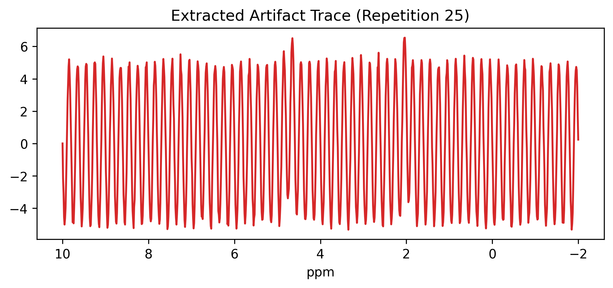
Because the widget generates standard xarray.isel() commands, your extracted slice_da perfectly retains all coordinates, named dimensions, and .attrs from the parent dataset. Your metadata lineage remains unbroken.